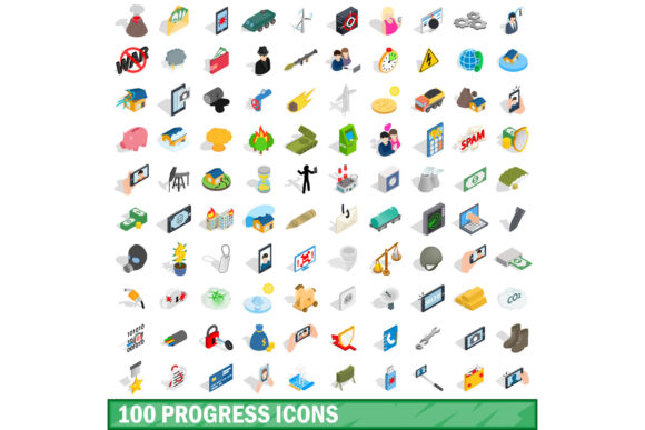
The Value of a Comprehensive 100 Progress Icons Set in Modern Design
Progress indicators are among the most essential yet understated elements in digital interfaces. They communicate state changes, provide feedback, and guide users through processes that would otherwise feel opaque. A 100 Progress Icons Set offers a library of pre-designed visuals that cover everything from simple loading spinners to multi-step workflow indicators. For designers and developers working across web, mobile, or desktop applications, having access to a diverse collection of these icons can significantly improve both the user experience and the speed of development.
When you consider how often users encounter waiting states, form submissions, file uploads, or multi-stage transactions, it becomes clear why progress icons matter. A well-designed progress indicator does more than just entertain the user during a delay. It sets expectations, reduces anxiety, and communicates that the system is working as intended. A set of 100 progress icons, when curated thoughtfully, can cover the vast majority of scenarios that arise in modern applications.
What Makes a Progress Icons Set Useful
Not all progress icons are created equal. Some are purely decorative, while others carry functional weight. A 100 Progress Icons Set becomes valuable when it includes variety in style, format, and purpose. You want icons that can represent different states: idle, in progress, paused, completed, failed, or pending. Each of these states might appear in different contexts, and having a dedicated icon for each prevents confusion.
For example, a spinning circle might work well for a loading screen, but it would be inappropriate for a step-by-step checkout process where customers need to know exactly where they stand. In that case, numbered steps, filled circles, and checkmarks become more appropriate. A robust icon set includes both types, allowing you to switch between modes depending on the user's task.
Another important quality is scalability. Icons must remain legible at different sizes, from small inline indicators next to buttons to larger hero elements on status pages. A 100 Progress Icons Set that is built on a consistent grid and uses clean vector paths will render clearly across all resolutions. This consistency also extends to stroke weight, corner rounding, and visual density, which collectively create a cohesive look when multiple icons appear together.
How Progress Icons Fit Into Modern Workflows
In today's development environment, speed and consistency are paramount. Teams often work with design systems that include typography, color palettes, and spacing rules. Adding a 100 Progress Icons Set to that system is a natural extension. Instead of designing custom progress indicators for every new feature, designers can pull from the set and maintain visual harmony across the product.
Consider a project management application. Users create tasks, assign deadlines, upload files, and track progress. Each of these actions benefits from a dedicated icon. A file upload might show a circular progress ring with a percentage inside. A task list could use checkboxes that transition from empty to half-filled to complete. A timeline view might use diamond or circle markers to indicate milestones. With a library of 100 progress icons, you can assign unique indicators to each of these scenarios without repeating the same visual three times.
Mobile apps also benefit heavily from consistent progress icons. Screen real estate is limited, so icons need to communicate meaning quickly. A progress icon that takes up too much space or uses ambiguous symbolism will frustrate users. A well-designed set prioritizes clarity, using symbols that are immediately understood across cultures and languages. This universality is a hallmark of professional icon design and a key reason why investing in a complete set pays off.
Practical Benefits for Design Teams
Design teams that adopt a 100 Progress Icons Set often report faster iteration cycles. Instead of drawing new icons for each sprint, they browse the collection, select the most appropriate option, and drop it into the mockup. This efficiency extends to prototyping as well. Tools like Figma and Sketch allow designers to swap icons quickly, making it easier to test different progress treatments with stakeholders.
Another benefit is accessibility. Progress icons that rely solely on color to convey state will fail for users with color vision deficiencies. A comprehensive set includes shapes, patterns, or text labels as redundancies. For example, a loading icon might combine a spinning animation with a text label that says "Loading..." or shows a percentage. A completed step might use a checkmark inside a circle, which is recognizable even when rendered in grayscale. Design teams that prioritize accessibility will find a good icon set indispensable.
Developers also appreciate having a single source of truth for icon assets. Rather than hunting through folders or pasting inline SVGs from random sources, they can import the entire 100 Progress Icons Set as a sprite sheet or a library of components. This reduces bloat, ensures consistency, and makes future updates easier. If the design team decides to refine the icons, they only need to update one library, and every instance in the codebase reflects the change.
Key Characteristics to Look For in a Progress Icon Set
When evaluating a collection, several characteristics determine its long-term usefulness. First, look for variety in animation support. Static icons work fine for many scenarios, but animated progress indicators are becoming standard for loading states and transitions. A set that includes both static and animated versions gives you flexibility. You might use static icons for step indicators and animated ones for spinners or progress bars.
Second, consider file format options. SVG is the gold standard because it scales infinitely and can be styled with CSS. PNG versions with multiple resolutions are also useful for legacy systems. Some sets even offer font formats, which allow icons to be inserted like text. A 100 Progress Icons Set that provides multiple formats will integrate smoothly into different tech stacks.
Third, examine the naming convention. Icons should be named intuitively so that team members can find what they need without guesswork. Names like "loading-spinner-01," "step-complete," "upload-progress-75," and "error-state" are far more useful than vague labels like "icon-24" or "progress-03." Good naming reduces friction during implementation and supports collaboration across teams.
Scenarios Where a Large Icon Set Shines
Certain industries and projects benefit disproportionately from a large progress icon library. E-commerce platforms, for instance, rely on progress indicators throughout the customer journey. A checkout process might involve adding items to the cart, entering shipping details, selecting payment methods, and confirming the order. Each step needs a clear visual indicator so customers do not abandon the transaction out of confusion. With 100 icons at your disposal, you can assign unique markers to every stage and even include sub-steps for complex flows.
Educational software is another domain where progress icons matter greatly. Students need to see their advancement through lessons, quizzes, and modules. A grid of icons can show which lessons are completed, which are in progress, and which are locked. The visual feedback keeps learners motivated and reduces the cognitive load of tracking their own progress. A set with 100 icons provides enough variety to represent different subjects, difficulty levels, or achievement milestones.
Healthcare applications also require precise progress indicators. Patients tracking medication schedules, appointment bookings, or rehabilitation exercises benefit from clear visual cues. A progress icon that shows a partially filled pill bottle or a step counter that increments with each completed exercise can make the experience more engaging and less clinical. The breadth of a 100-icon set ensures that even niche scenarios are covered.
Considerations Before Choosing a Set
Before adopting any icon set, consider the licensing terms. Some sets are free for personal use but require a purchase for commercial projects. Others are open source and can be modified freely. A 100 Progress Icons Set with a permissive license gives you the freedom to adapt the icons to your brand without legal concerns. Always read the fine print, especially if you plan to distribute the icons within a larger product or template.
Another consideration is the visual style. Does the set match your brand's aesthetic? Icons with sharp angles and minimal detail suit modern, flat designs. Icons with gradients and shadows feel more polished and might work better for premium applications. Consistency in style across all 100 icons is crucial, because mixing different styles in the same interface looks unprofessional. Most reputable sets maintain a unified design language from the first icon to the last.
Finally, think about future maintenance. Software evolves, and new features often require new progress indicators. A set that is actively maintained by its creator or community will receive updates over time. If the set is a one-time release with no support, you might find yourself needing to create custom icons later that do not match the originals. Choosing a well-supported set saves headaches down the road.
Integrating Progress Icons Into Your Workflow
Once you have selected a 100 Progress Icons Set, the next step is integration. Start by mapping out all the scenarios in your application that require progress indicators. Create a spreadsheet or document that lists each scenario alongside the icon you intend to use. This exercise reveals gaps and ensures that no state is left without a visual cue. It also helps you spot opportunities to reuse icons intelligently, reducing redundancy.
Next, implement the icons in your design system. Define which icon corresponds to each state, and document the rules for using them. For example, you might specify that loading states always use a spinning icon with a text label, while completed states use a filled circle with a checkmark. These guidelines keep the interface consistent and make onboarding new team members easier.
Finally, test the icons with real users. Show them different progress states and ask what they expect to happen next. If an icon is ambiguous, consider replacing it with a clearer option from the set. User testing often reveals that what designers find intuitive is not always obvious to end users. A 100-icon library gives you enough alternatives to iterate until you find the perfect fit.
The Long-Term Value of a Complete Set
Investing in a comprehensive progress icon set is not just about convenience today. It is about building a foundation that supports growth. As your product adds features, users, and complexity, the need for clear progress communication only increases. Having a library of 100 carefully designed icons means you are prepared for that growth. You will not need to scramble to design new indicators under time pressure, and your interface will maintain a professional, cohesive appearance across every update.
Moreover, users notice when an interface is thoughtfully designed. Consistent, clear progress indicators contribute to a sense of reliability and polish. They reduce friction, build trust, and ultimately improve retention. In a competitive market, small details like these can differentiate a product from its alternatives. A 100 Progress Icons Set is one of those investments that pays dividends in user satisfaction and operational efficiency over the long term.
Whether you are building a simple landing page or a complex enterprise application, progress icons are a silent workhorse of user experience. Choosing a complete, well-designed set ensures that you never have to settle for a generic spinner or a confusing placeholder again. The right icons make every interaction feel intentional, and that is the kind of quality that keeps users coming back.